Adding fonts
Every design starts with the standard web fonts — Arial, Georgia, Courier and the rest — plus three display faces UHT includes for you: Luckiest Guy, New Rocker and Pacifico.
That is rarely where you want to stop. The designer gives you the entire Google Fonts library, just under two thousand typefaces, and adding one takes about fifteen seconds.
Step 1 — open the font manager
The A button sits on the second row of the toolbar:
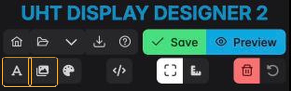
It opens Manage Google Fonts, which lists the fonts this design currently carries:
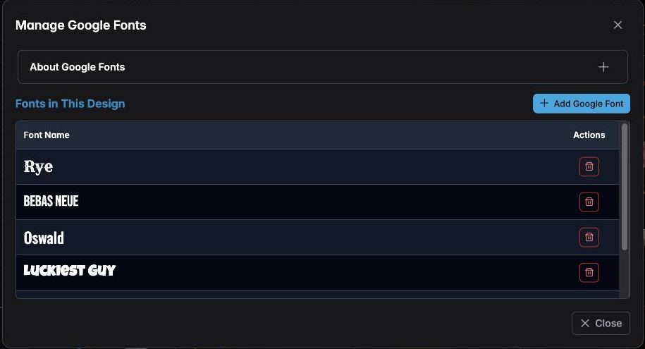
Each row previews the font in its own typeface, so you can see what you already have without guessing from the name. The bin icon removes one from the design.
If a component is set to a font you delete here, that component falls back to a default face. Check your components before removing anything.
Step 2 — browse the library
Press Add Google Font (or Browse Google Fonts at the top right). The dialog switches to the full library:
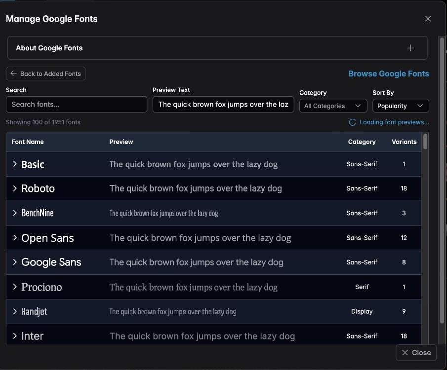
Four controls make this manageable:
- Search — type part of a name.
- Preview Text — replace the sample sentence with your own. Type your tournament's name here and every row previews that, which is a far better test than "the quick brown fox".
- Category — Serif, Sans-Serif, Display, Handwriting, Monospace. Display is where most poker-clock fonts live.
- Sort By — Popularity is a reasonable default; popular fonts are popular because they are legible.
The counter under the search box tells you how many fonts match.
Step 3 — find the one you want
Searching narrows the list immediately:
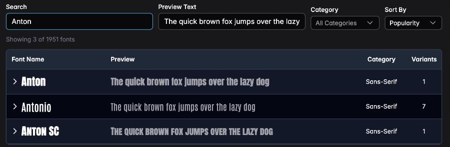
Note the Variants column. A font with 18 variants offers eighteen weights and styles; one with a single variant offers only Regular. More variants means more flexibility, but each one you add is another file the display has to fetch.
Step 4 — add a variant
Click the arrow at the left of a row to expand it. The available weights appear, each with its own + button:
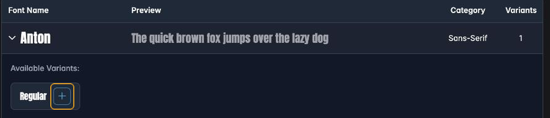
Press + on the weight you want. Add only the weights you will actually use — a design carrying six weights of a font it uses once is slower to load on a television.
The row confirms it immediately:

Press Close when you have what you need.
Step 5 — use it
Select any text component and open its Font dropdown in the sidebar. Your new font is now in the Google Fonts group at the top, previewed in its own typeface:
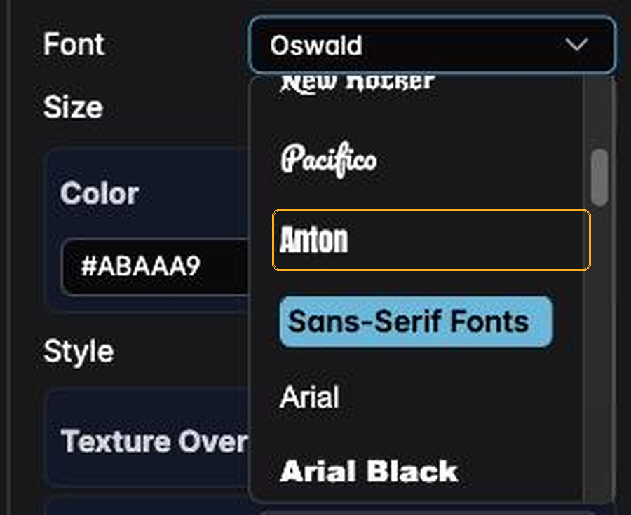
Choose it and the canvas redraws in that face straight away. There is nothing to save or apply — the change is live, and Preview will show exactly the same thing.
The font travels with the design, so anyone you share it with sees the same typography.
Choosing well
A poker display has two jobs, and they want different fonts.
The decorative parts — the tournament name, a venue title, a section heading — can carry as much personality as you like. This is what display faces are for.
The functional parts — the clock, the blinds, the prize figures, the player count — must be readable across a room, at an angle, by somebody who has been playing for six hours. That means:
- A heavy, wide face. Condensed fonts fit more in, and cost you legibility at distance.
- Digits that are all the same width. Otherwise
1is narrower than8and the clock visibly jitters every second. Fonts advertising tabular figures solve this; UHT's Stabilize Numbers setting in Text Settings handles the rest. - No thin strokes. Hairline weights disappear on a bright screen in a lit room.
If you take one rule from this page: never put a script or handwriting font on the clock.
When there is no internet
Google Fonts are fetched from Google when the display loads. A screen with no internet connection falls back to a standard system font — the design still works, but it will not look the way you designed it.
This matters if your venue's wifi is unreliable, or if you run somewhere with no connection at all. In that situation, use the built-in faces for anything critical and keep custom fonts for decoration, so a fallback costs you style rather than legibility.
Multi-monitor displays need internet in any case, so this only really affects a single screen running offline. See multi monitoring.
Next
- Components — the full Text Settings panel, including outlines, shadows and Stabilize Numbers
- Managing resources — images, and the storage budget they share