Components
A display is built entirely from components. You drag one out of the sidebar, drop it on the canvas, and configure it in the settings panel.
They divide into two kinds, and the distinction matters:
- Generic components — Text, Image, Shape, Container. These draw whatever you tell them to. Text becomes tournament data by carrying placeholders.
- Data components — Prizes, Blind Display, Chip Denominations and the rest. These already know what they are for. Drop one on the canvas and it draws itself from the tournament, with no placeholders needed.
Every screenshot below is the component as it appears the moment it lands, with no styling applied.
Every component has a Component Help button in its settings panel, with detailed notes on each option. It is more thorough than this page.
Text
The most-used component by a distance. Anything you can type, with placeholders for live data.
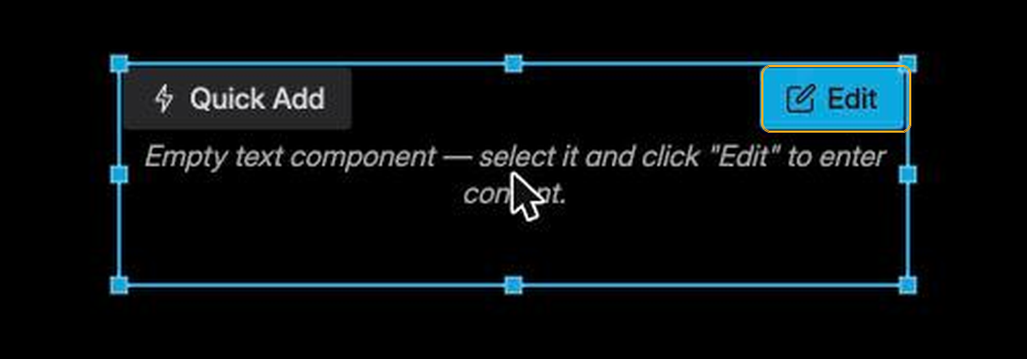
A new text component is empty. Select it and press Edit on the component itself — the content is not edited in the sidebar. See Your first display for the full walkthrough.
The sidebar controls how it looks: font, size, colour or gradient, alignment, text case, outline, border, shadow, rotation, and a set of animated effects.
Three settings are worth knowing about early:
- Shrink To Fit Content — reduces the size automatically when the text is too long for its box. Useful for tournament names of unpredictable length.
- Stabilize Numbers — gives every digit the same width so a running clock stops jittering.
- Circular Mode — bends the text around a circle.
Image
A picture: a club logo, a sponsor banner, a photograph.
Drop one and it shows a Select Image button; press it to choose from the images stored in this design. Upload new ones through the image manager — see Managing resources.
Shape
Rectangles, circles, polygons and lines. These are the panels, frames and dividers that give a display structure.
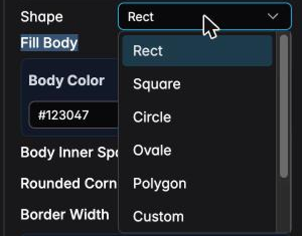
The same component covers all of them; the Shape dropdown decides which. Styling is covered by fill, rounded corners, border width and colour, per-side borders, shadow and rotation:
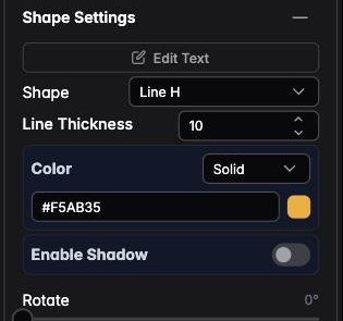
A few seconds of configuration produces very different objects:
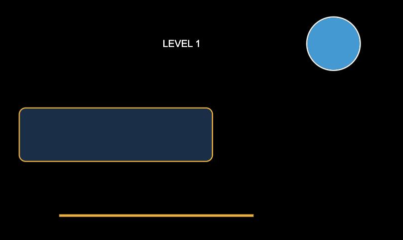
A filled rounded rectangle with a contrasting border makes a card to sit numbers on. A filled circle works as a badge for a chip value or a player initial. A Line H divides two halves of a display.
A shape has its own Edit Text button and the full Text Settings panel. A "panel with a label on it" is therefore one component, not two — and when you move it, the label moves with it.
Prizes
The payout table, filled in from the prize pool and your payout structure.
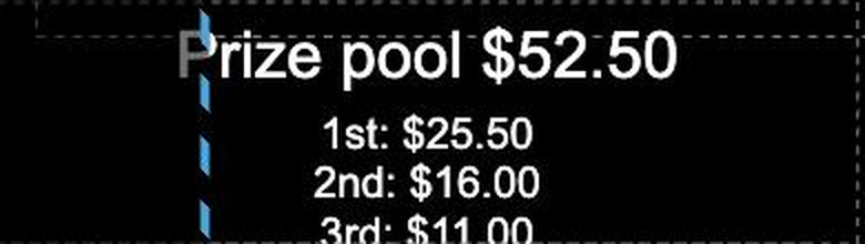
It recalculates itself as entries arrive, so the figures on screen are always current. Settings control how many places to list and how the amounts are formatted. Turn on Show league points to add the league points each paid-out place earned (tournaments that count for a club league).
Chip Denominations
The chips in play, drawn as chips rather than described as numbers.
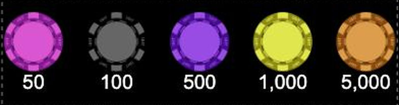
This is what makes "colour up the greens" mean something to a table of players. The artwork comes from your chip set — see Import your chips.
Blind Display
One blind level, as small blind / big blind / ante.
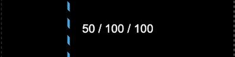
The Level setting is an offset, not an absolute number:
0— the level being played now1— the next level2— the one after that
Two of these side by side, set to 0 and 1, is the standard "current and next blinds"
arrangement.
Blind Schedule
Several levels at once, as a table, so players can see what is coming.
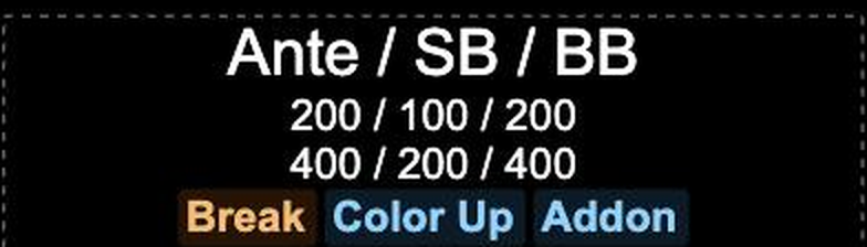
Note the markers: Break, Color Up and Addon are flagged on the levels where they occur, which answers most of the questions players would otherwise ask you.
Analog Timer
The level clock as a dial rather than digits.
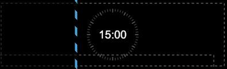
A ring that visibly empties is readable from further away than numbers, and from a wider angle. Many designs use both: a large digital clock, and a dial for the players at the far tables.
Bounty Display
Bounty information, in a form that adapts to the bounty format in use.
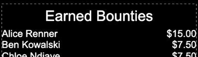
Depending on its settings it shows who has collected the most, who carries the largest bounty, or the full earned-bounties table above.
In a tournament without bounties this component says so rather than drawing an empty table. If you see that message while designing, switch your preview configuration to one with bounties — see Tournament options.
See Bounty tournaments for the formats themselves.
Chip Stack Leaders
The largest stacks, ranked. A natural centrepiece for a feature-table display, and only meaningful if you are recording chip counts.
League Leaderboard
The standings of the club league the tournament counts for, one row per league player. Points include what the running tournament adds, so the list re-sorts live as players bust out.
Each row is formatted with a template. The default, $points Points +$change, shows the
player's total and the points this tournament adds; you can also use $pos and $name. If the
tournament is not part of a league, the component shows a short hint instead.
To design with sample data, select Dummy Tournament (With League).
Color Up
Announces a colour-up: which denomination is being removed and what replaces it. It appears when the current level is marked as a colour-up in your blind structure, so on any other level it stays quiet.
Progress Bar
A bar that fills between two values.
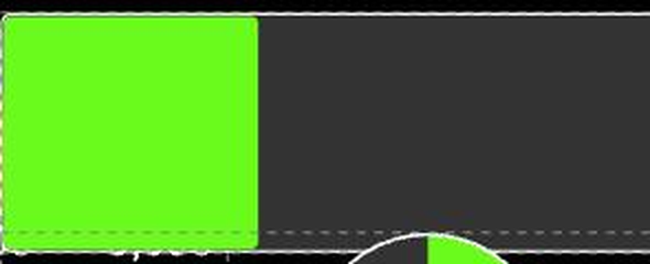
It is deliberately not tied to any one thing — you supply the numbers. Common uses: time remaining in the level, progress through the structure, entries against a target.
Circular Progress
The same idea as a ring rather than a bar.
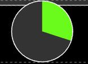
Better than a bar where space is square rather than wide, and a natural partner for a large central clock.
Tournament Controls
Puts the start/pause and level controls inside your design, rather than in the fixed bar at the bottom of the screen.
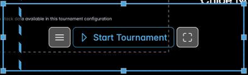
Useful when a display doubles as the control surface — a tablet at the desk, for example. Leave it out of designs meant for a television that nobody touches.
QR Code
The multi-monitor display link, as a scannable code.
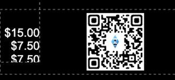
Put this on screen and anyone can point a phone at it to open the timer on their own device — a genuinely useful thing at a large game, where players at the far tables cannot read the main screen.
It only produces a code when multi monitoring is enabled for the tournament. See Multi monitoring.
Embed Stream / Video
A live web page inside the display: a YouTube video, a Twitch stream, a scoreboard, a sponsor loop.
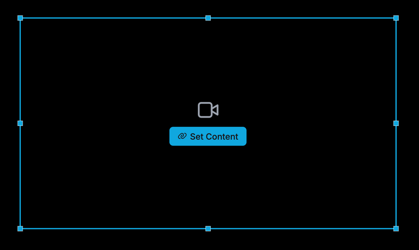
A new one is empty and offers Set Content. Paste an ordinary YouTube, Twitch, Vimeo or Kick link and it is converted to an embed link for you; anything else has to be a link the provider already allows to be embedded.

The content can also be changed while the tournament runs, from the display itself — which is what makes it worth putting on a screen that is going to be up for six hours.
See Embedding streams and video for the full page: what converts, what does not, and how it behaves across multiple screens.
Container
A container draws nothing itself. It arranges other components.
Drop components into one and it positions them as a group — horizontally or vertically, with spacing and alignment you control. Move the container and everything inside moves with it.
Two reasons to use one:
- Grouping. A label and its value belong together. In a container, they stay together.
- Automatic layout. Components in a container can be told to stretch and share the available space, so a row of three stays evenly spaced whatever their content.
Containers can be nested, which is how complex displays stay manageable.
Next
- Embedding streams and video — the Embed component in depth
- Using placeholders — turning a text component into live data
- Display conditions — showing a component only sometimes
- Layers — swapping whole screens at a break